From Thought to Form
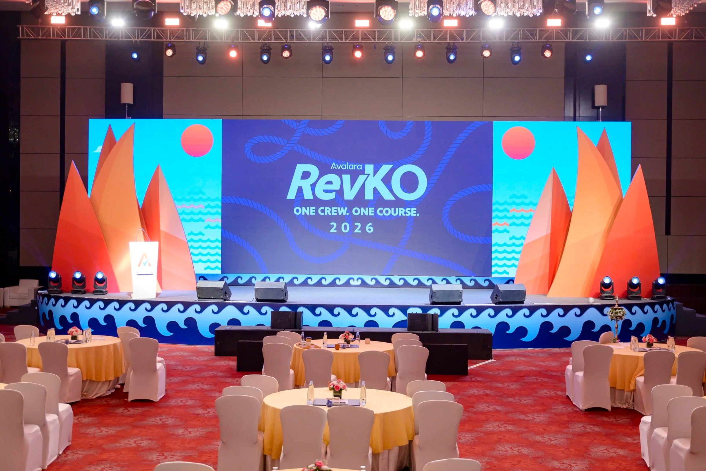
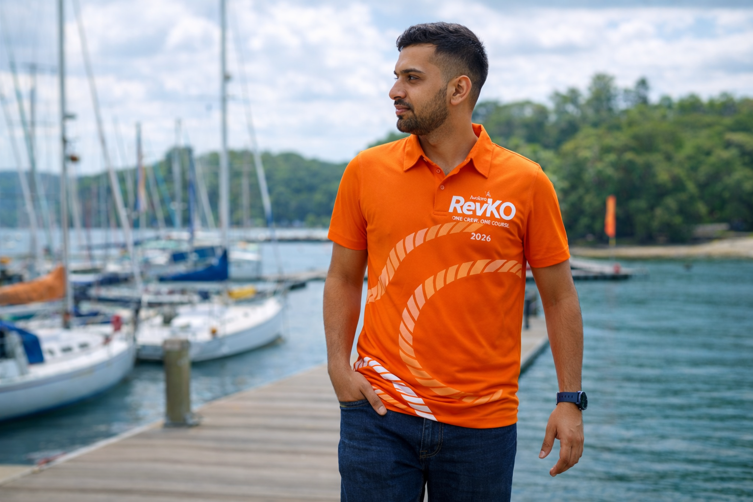
RevKO 2026
-
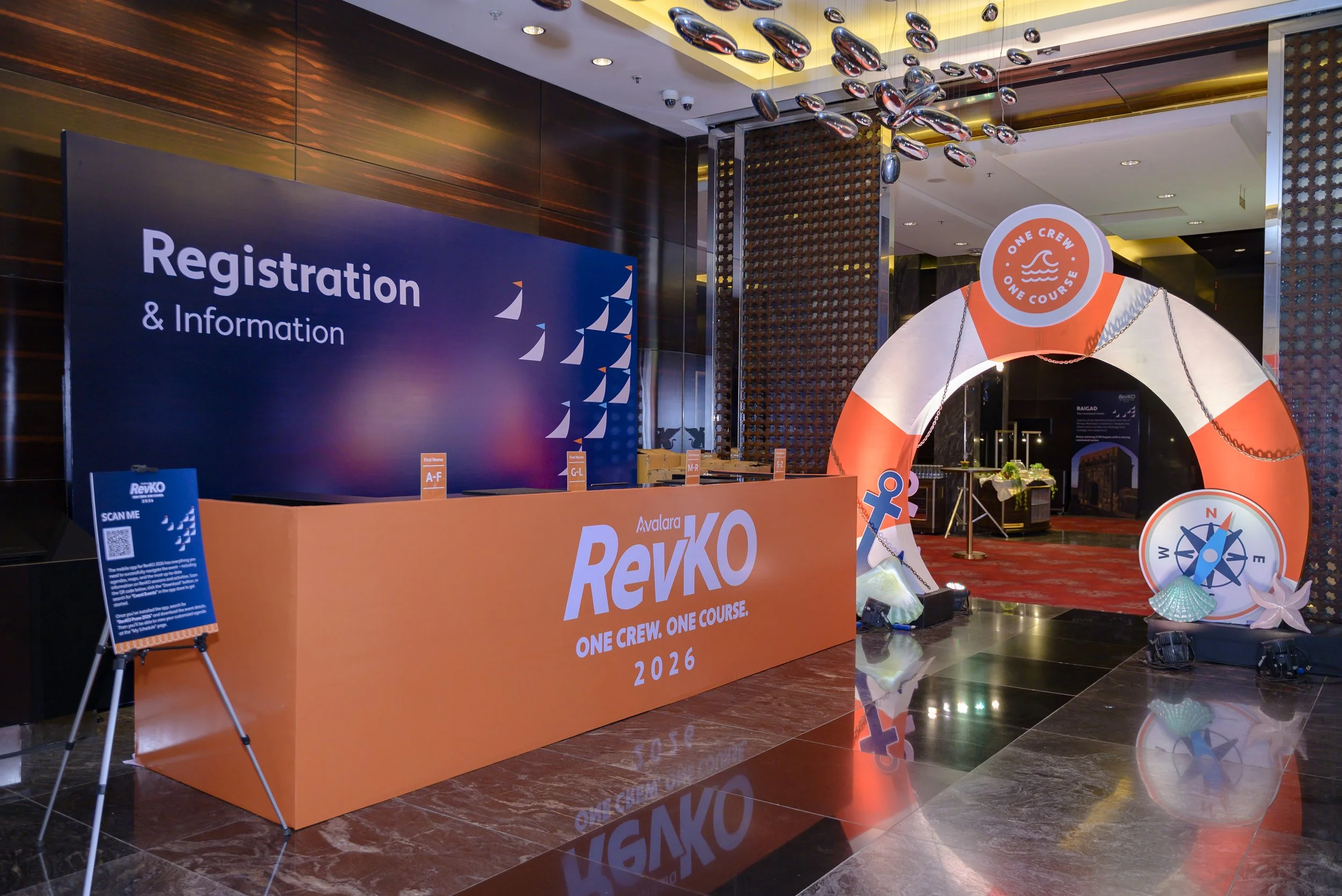
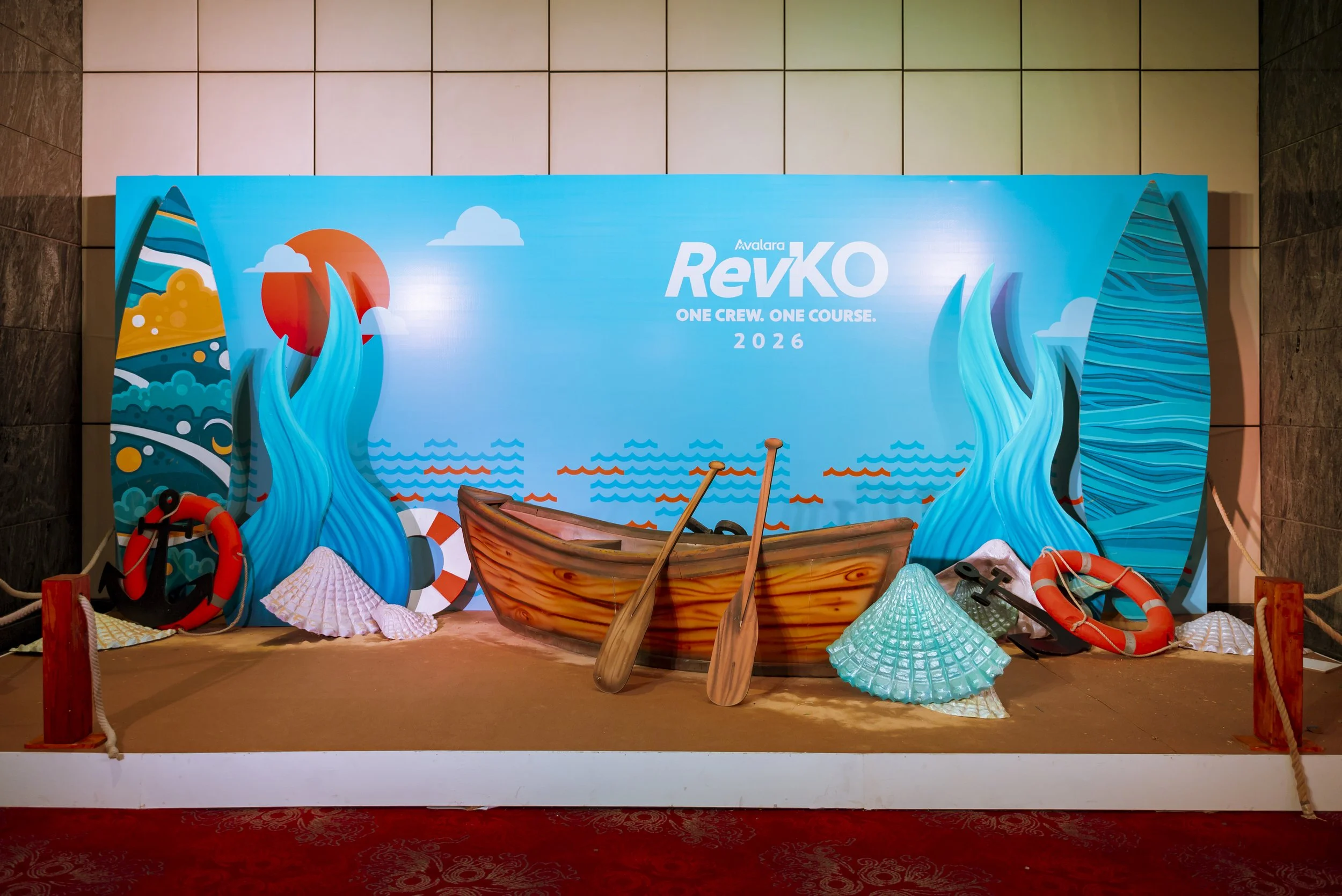
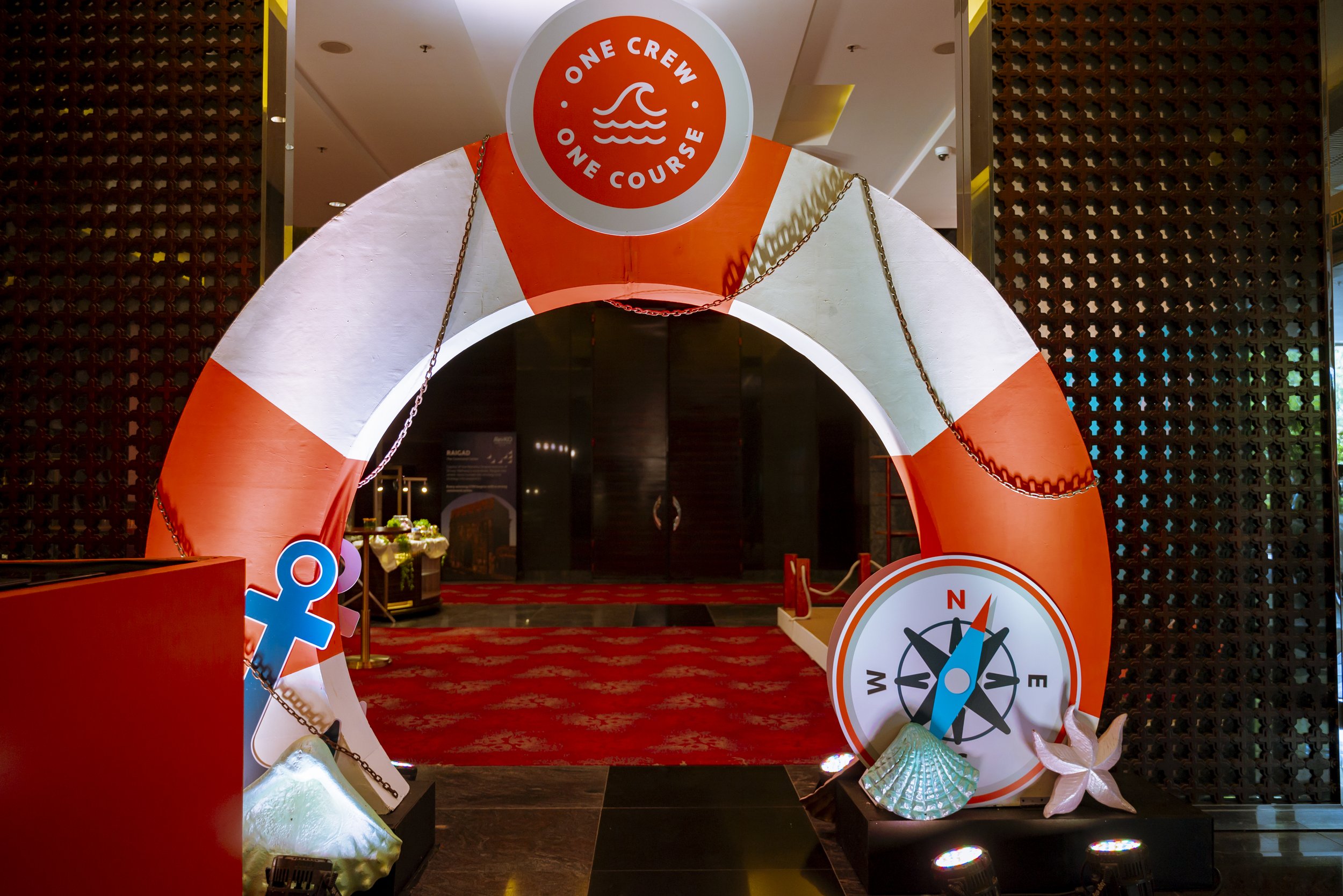
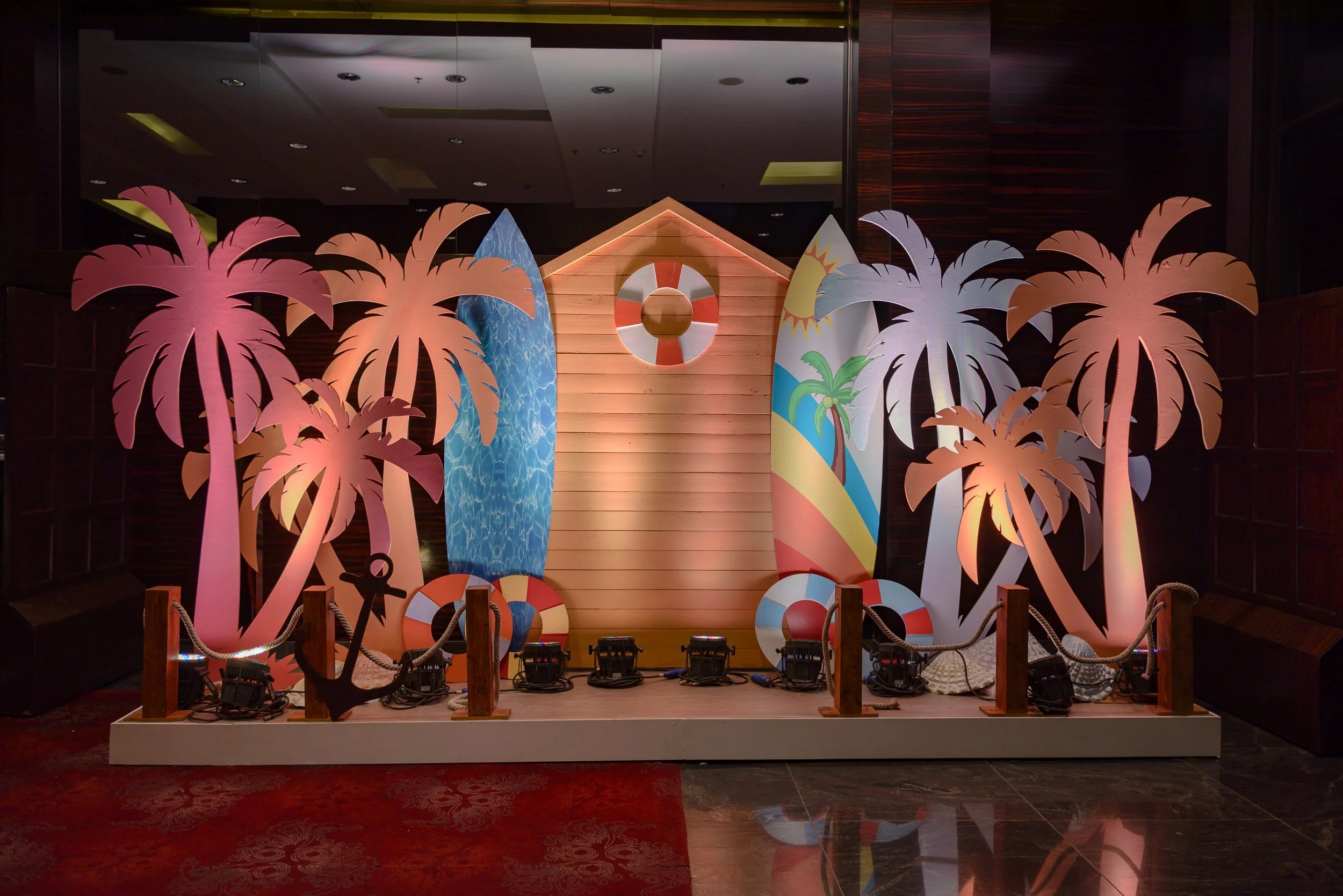
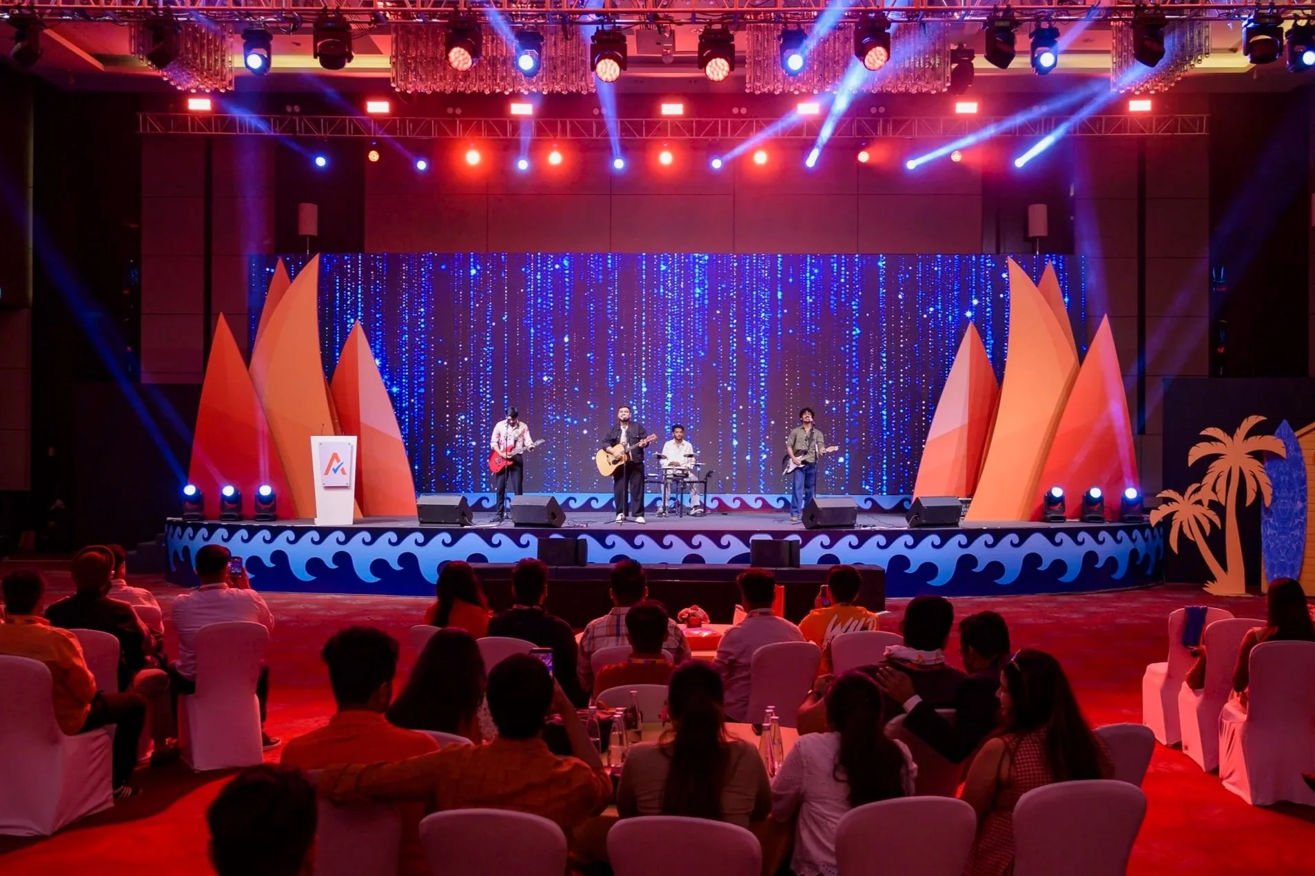
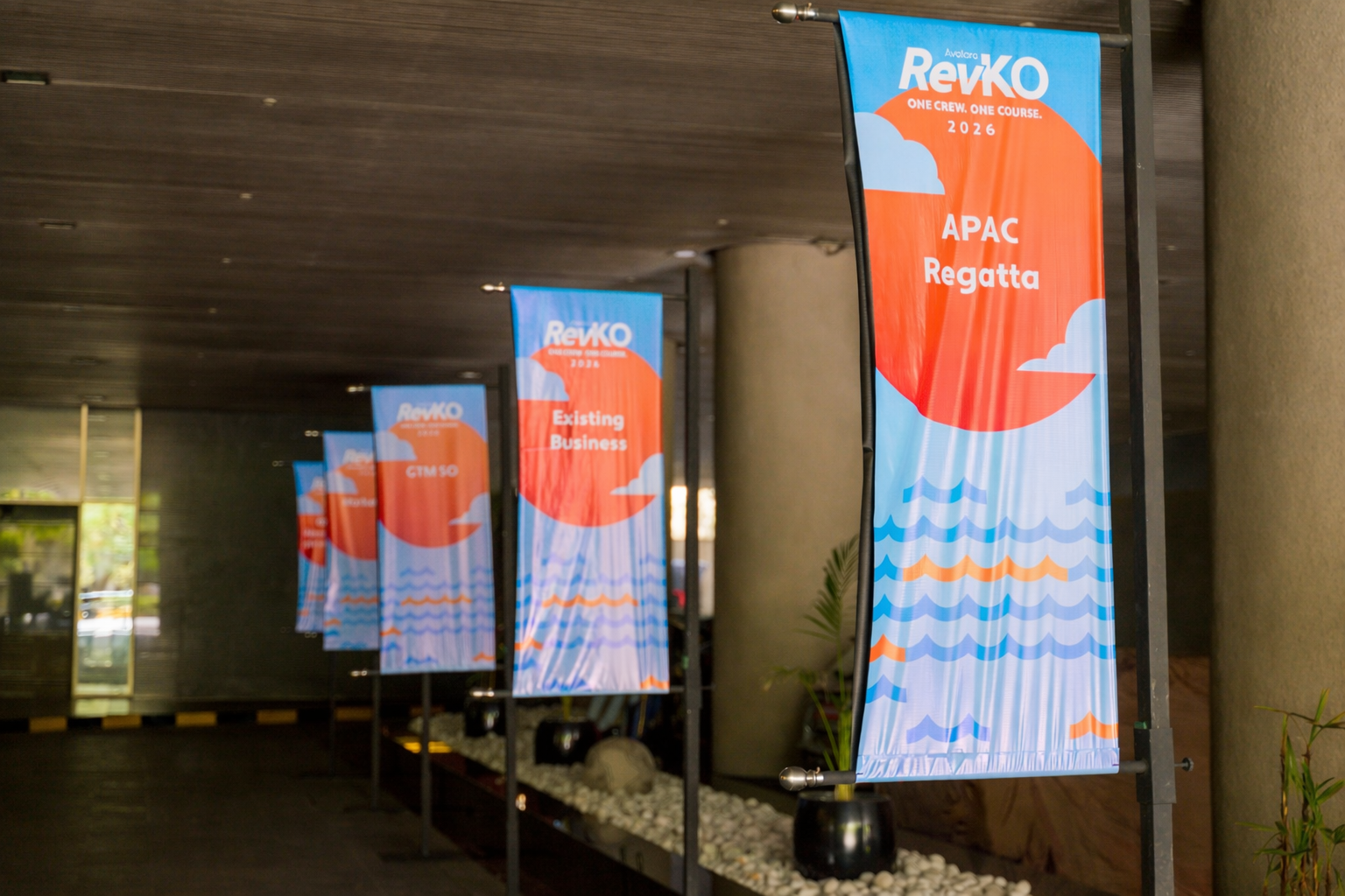
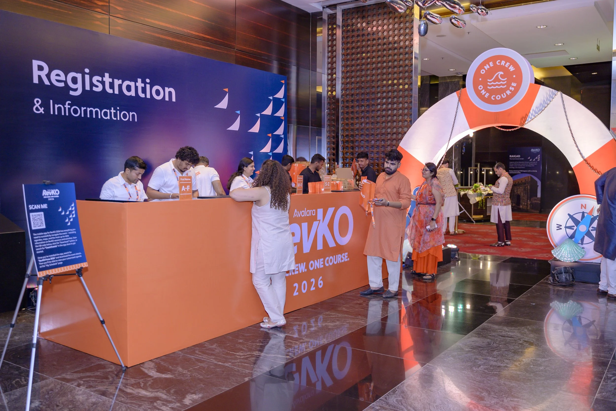
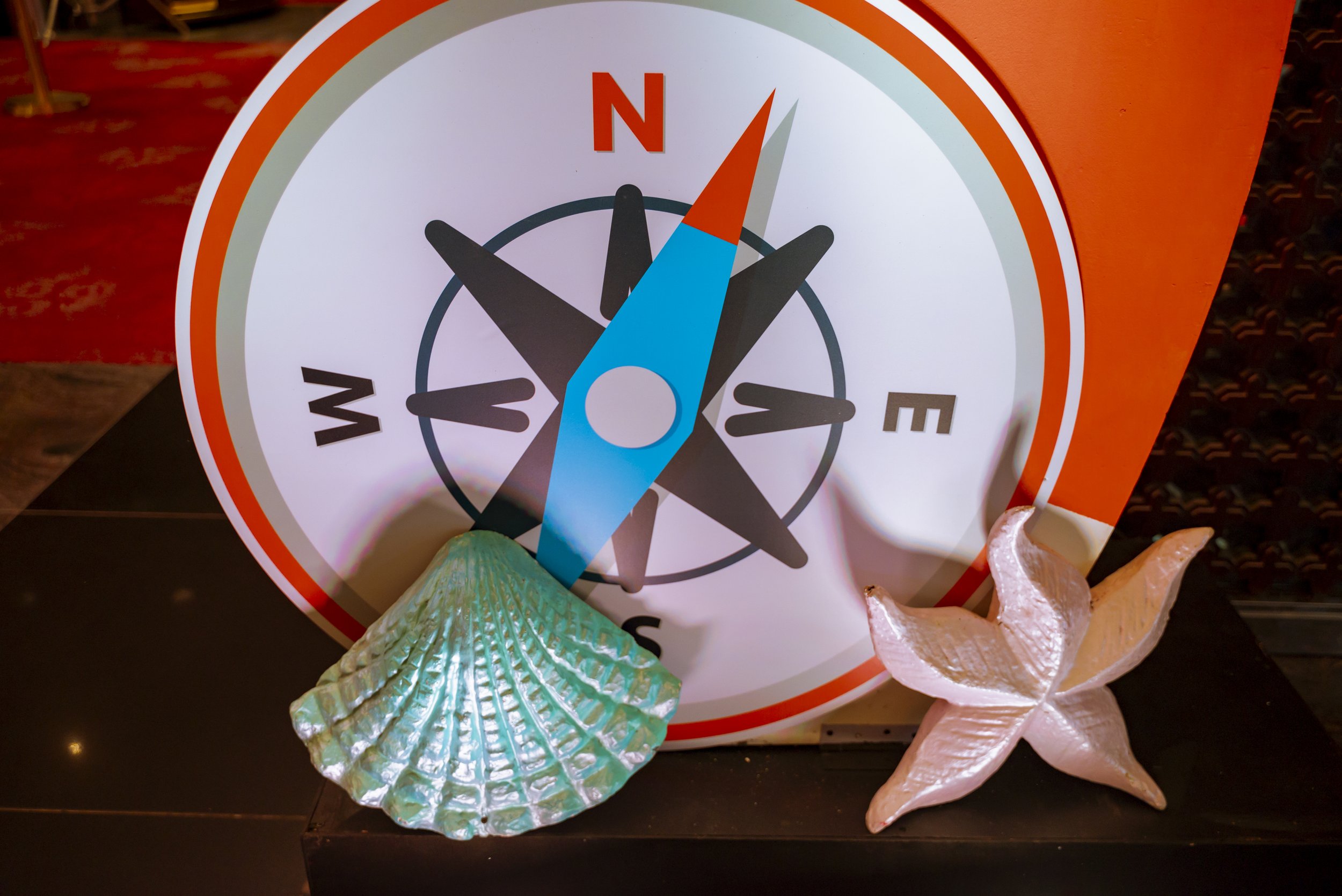
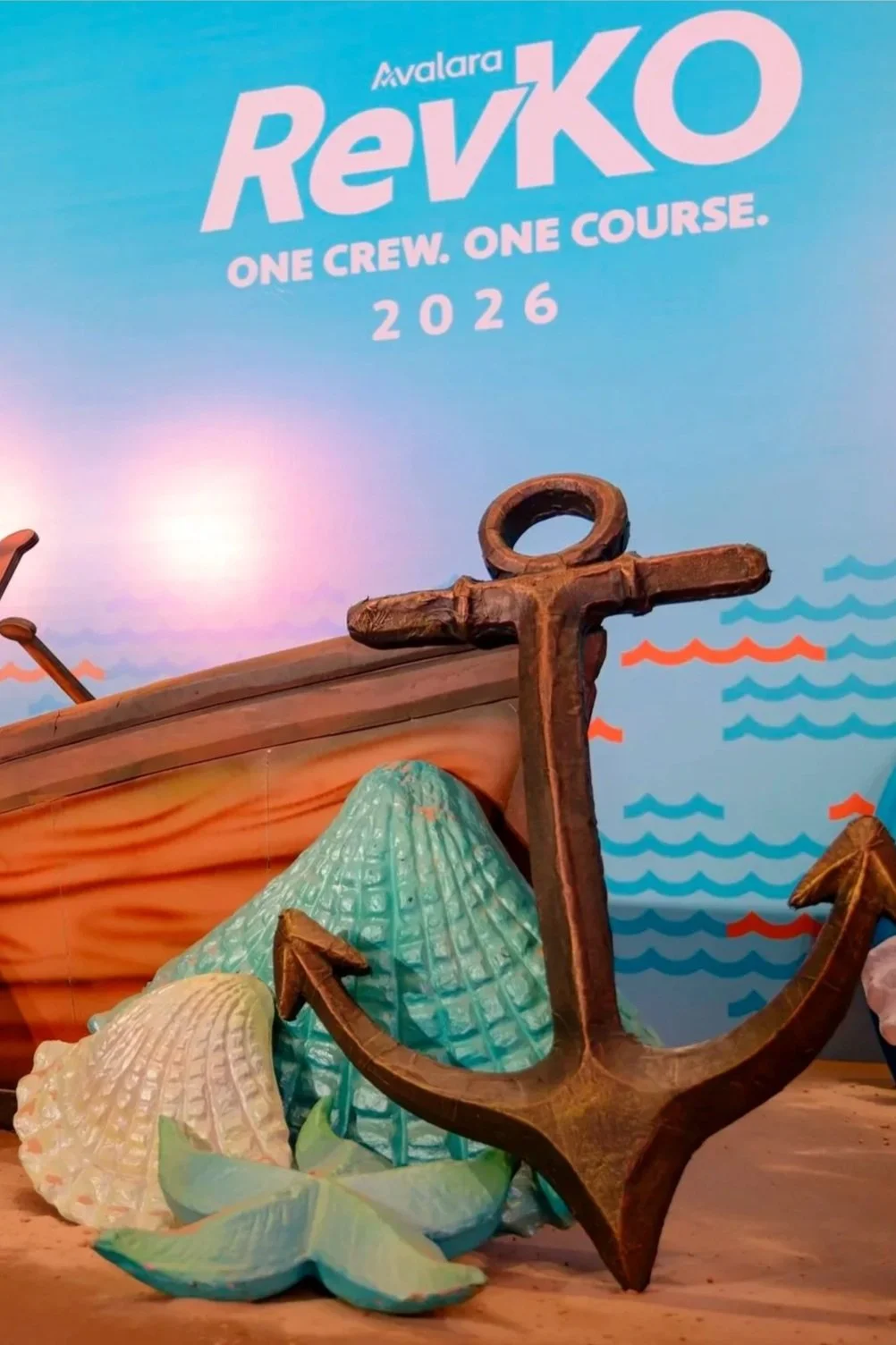
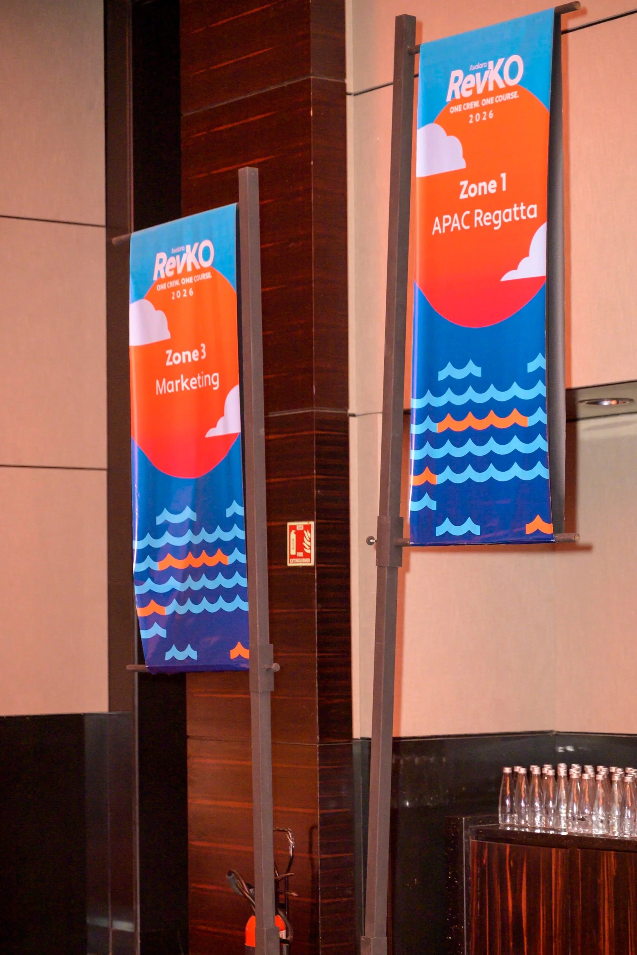
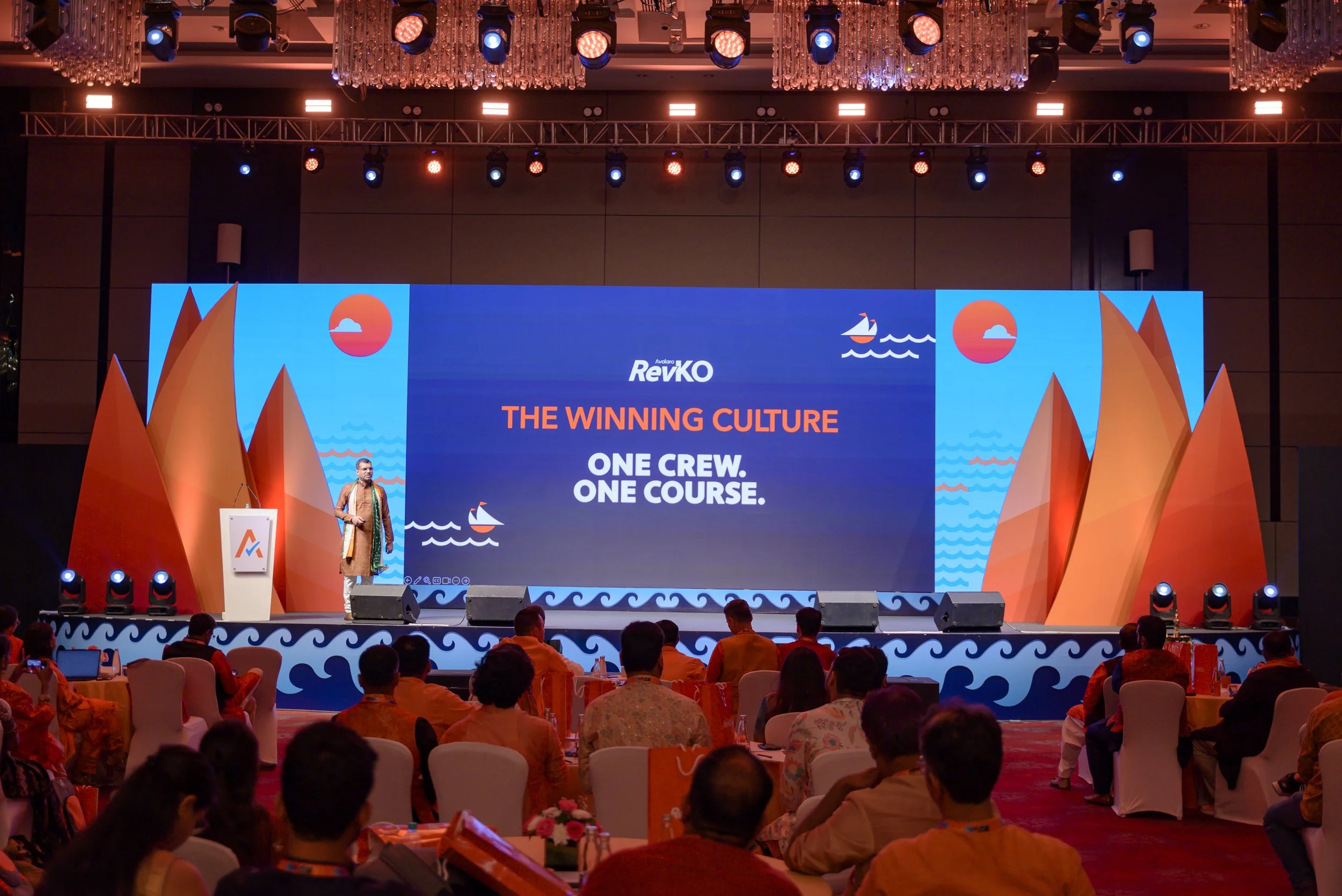
RevKo 2026 was a corporate event built around Project Regatta—an internal initiative aimed at aligning go-to-market teams under shared revenue goals. The event theme, “One Course – One Course,” drew from the metaphor of a regatta, where multiple boats move in sync toward a single finish line.
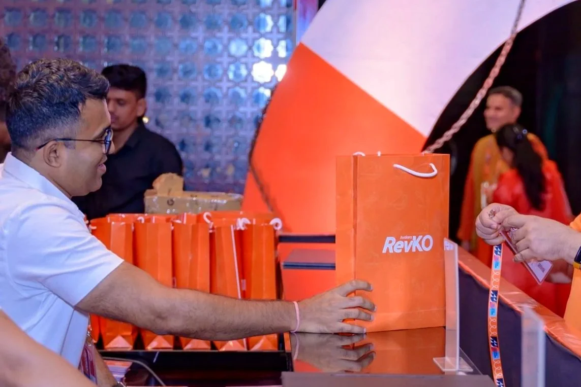
I led the end-to-end visual and spatial design for the event, translating this metaphor into a cohesive physical experience. The scope included stage design, spatial branding, merchandise, two photobooth concepts, and a comprehensive event kit featuring stickers and fridge magnets.
-
The core challenge was to transform an abstract organizational strategy into a tangible, engaging event experience.
Project Regatta represents a shift from siloed team metrics to unified outcomes—something that can feel conceptual and distant for employees. The event needed to:
Communicate alignment and collaboration clearly
Break down the idea of “boats” and shared direction in an intuitive way
Maintain strong visual consistency across multiple touchpoints
Engage attendees beyond passive consumption
In short, the challenge was to make strategy felt, not just understood.
-
Approached the project by grounding every design decision in the regatta —movement, direction, and yes the complete synchronization.
Concept Development
I built a visual language inspired by sailing elements—courses, waves, motion lines, and directional flow—to represent alignment and forward momentum.Spatial Design
The stage and venue were designed to feel immersive, with directional cues and layered visuals guiding attention—mirroring the idea of boats moving on a shared course.Experience Touchpoints
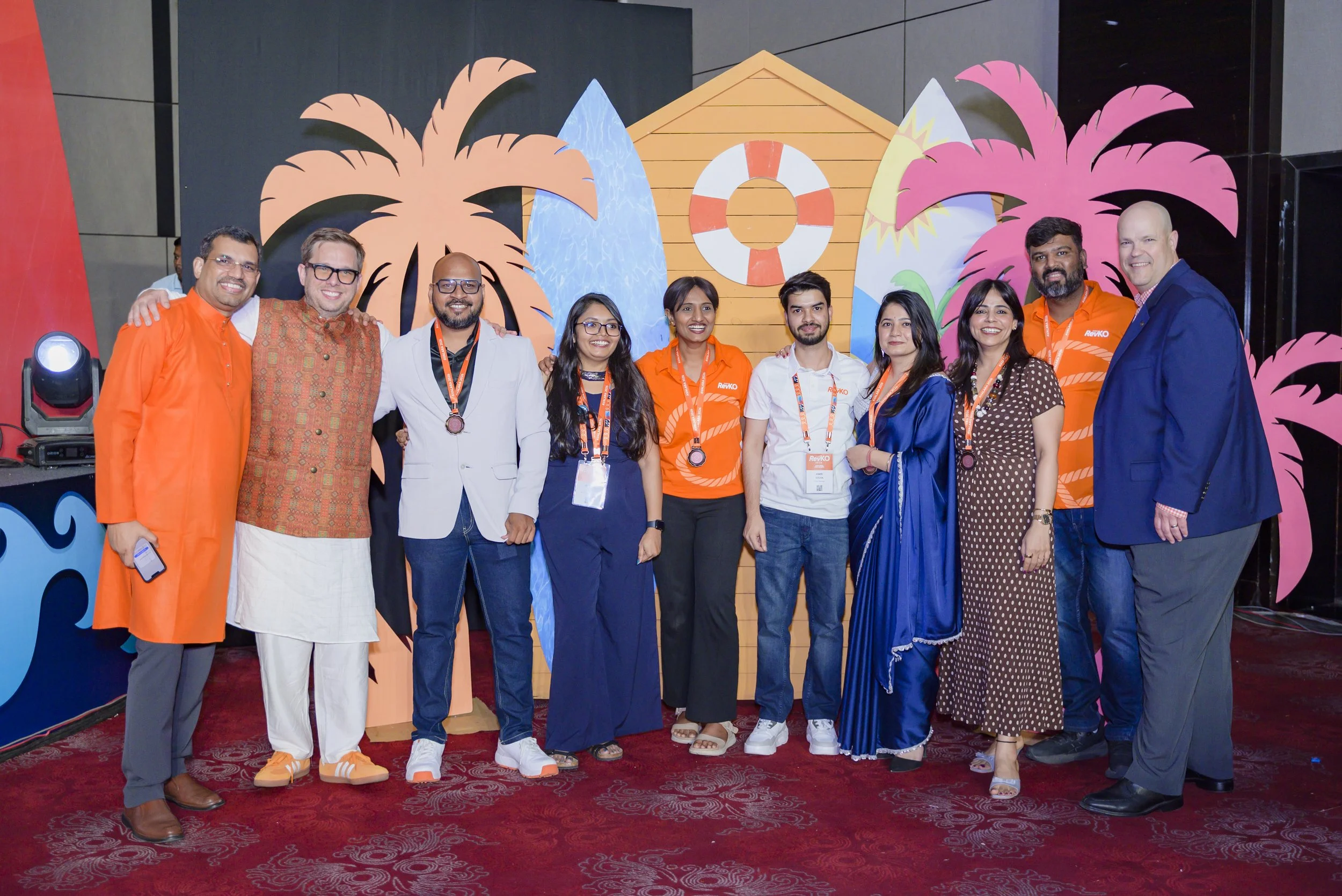
Designed two photobooths that extended the narrative, allowing attendees to “be part of the regatta”
Created merchandise and event kits that reinforced the theme through minimal, memorable visuals
Ensured consistency across stickers, magnets, and physical assets to strengthen recall
-
The final experience translated a complex organizational shift into a clear and engaging visual story.
The regatta theme made alignment intuitive and relatable
A consistent design system unified all touchpoints
Interactive elements increased participation and recall
Successfully reinforced the idea of teams moving together toward shared goals
Specially recognized, awarded, and honored by the VP – India for design impact and execution
Charting ideas into experiences
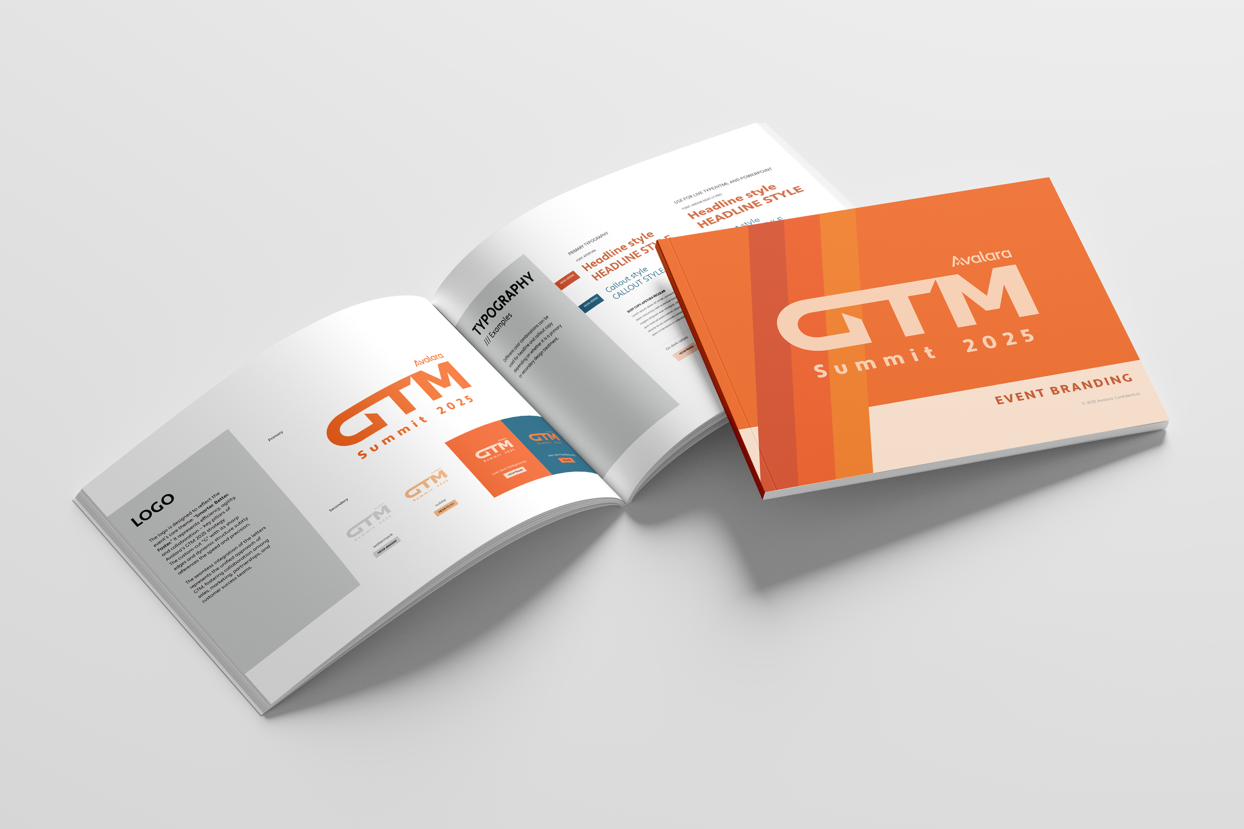
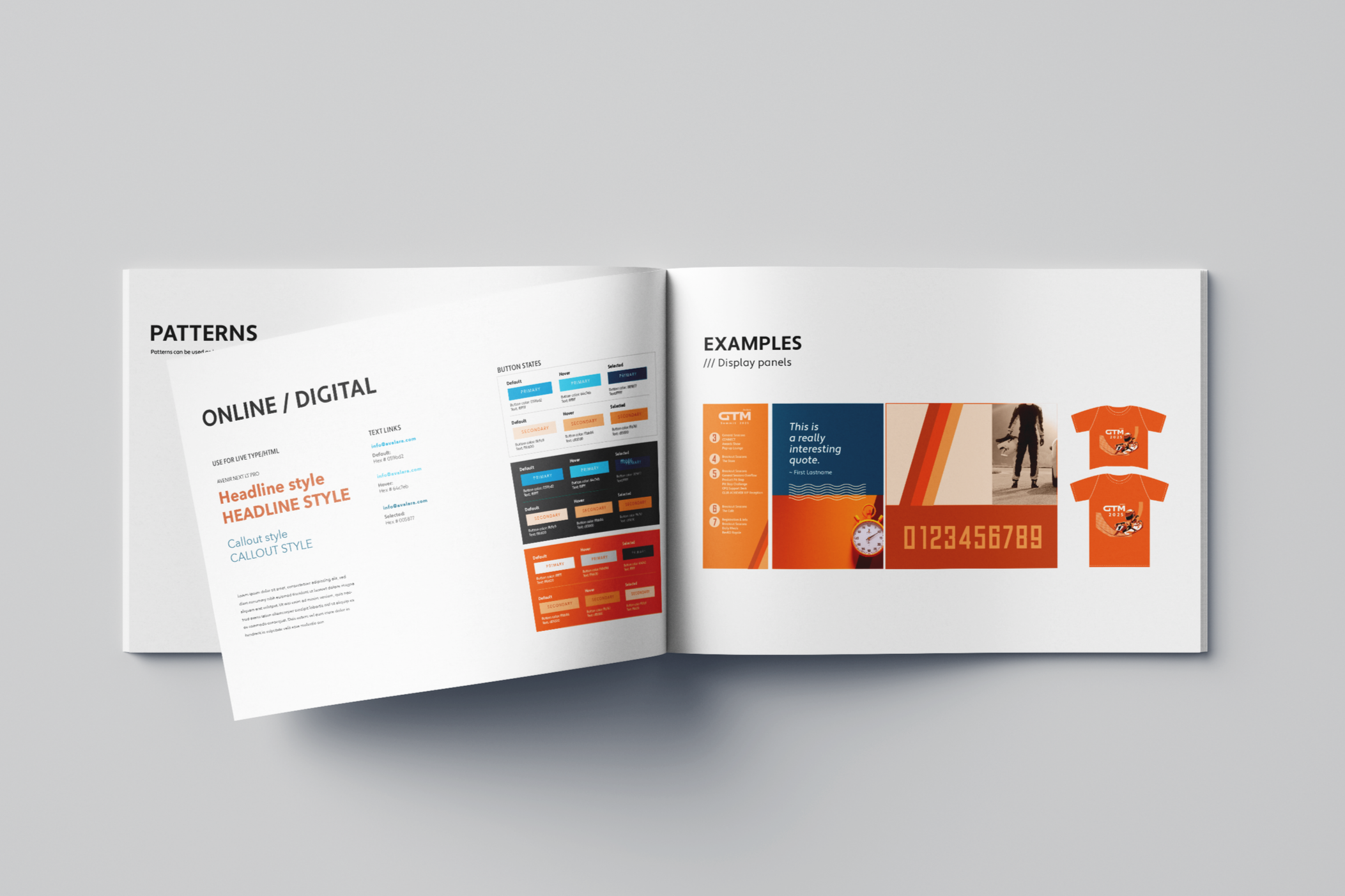
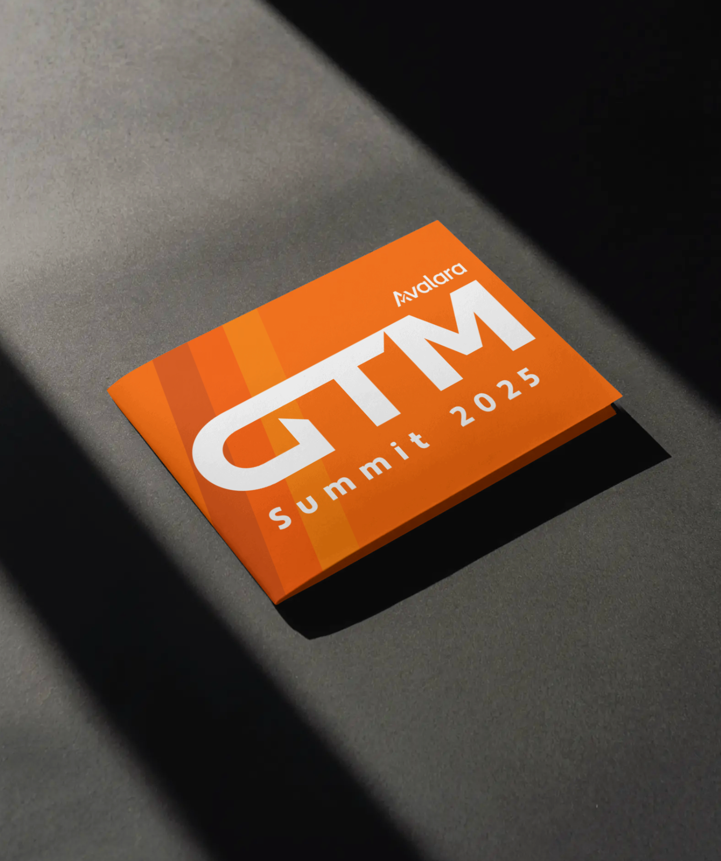
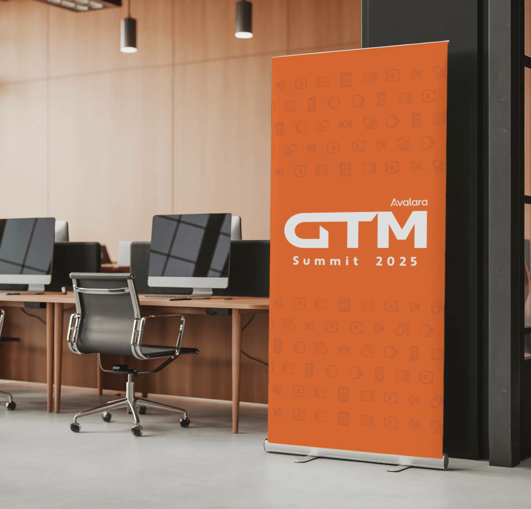
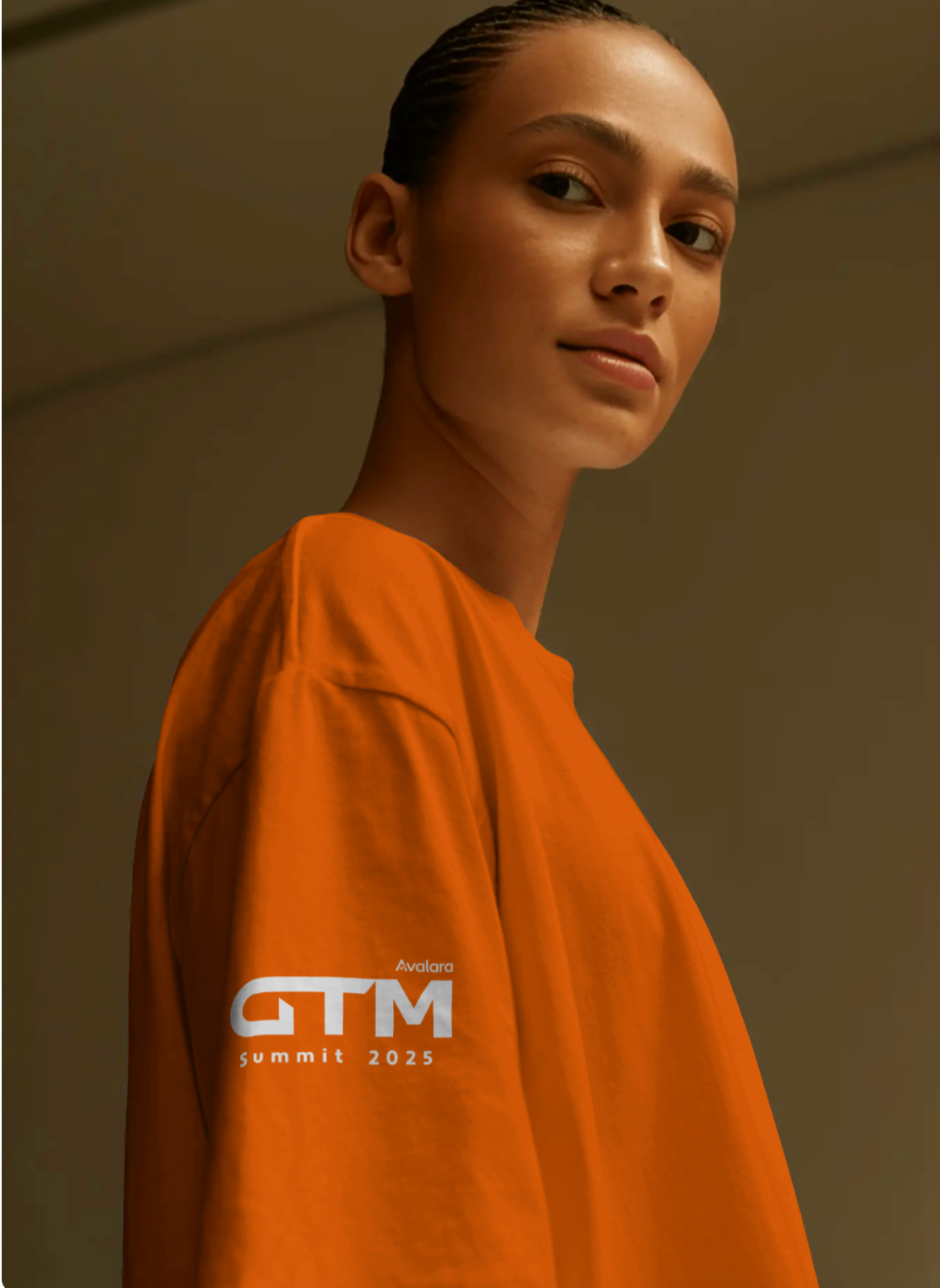
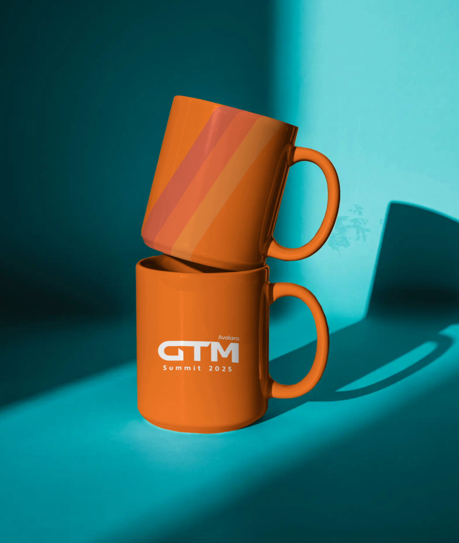
Go To Market (GTM)
-
GTM – Go to Market is Avalara’s annual revenue kickoff event, bringing teams together to align, learn, and drive growth. Through impactful sessions, strategy the event fosters drive and innovation, while celebrating achievements and the drive for the year ahead.
-
The event required a distinct brand identity that could set an inspiring tone and motivate employee participation. It needed to resonate on an individual level while encouraging teams to push boundaries, perform better, and aim for bigger achievements year after year.
-
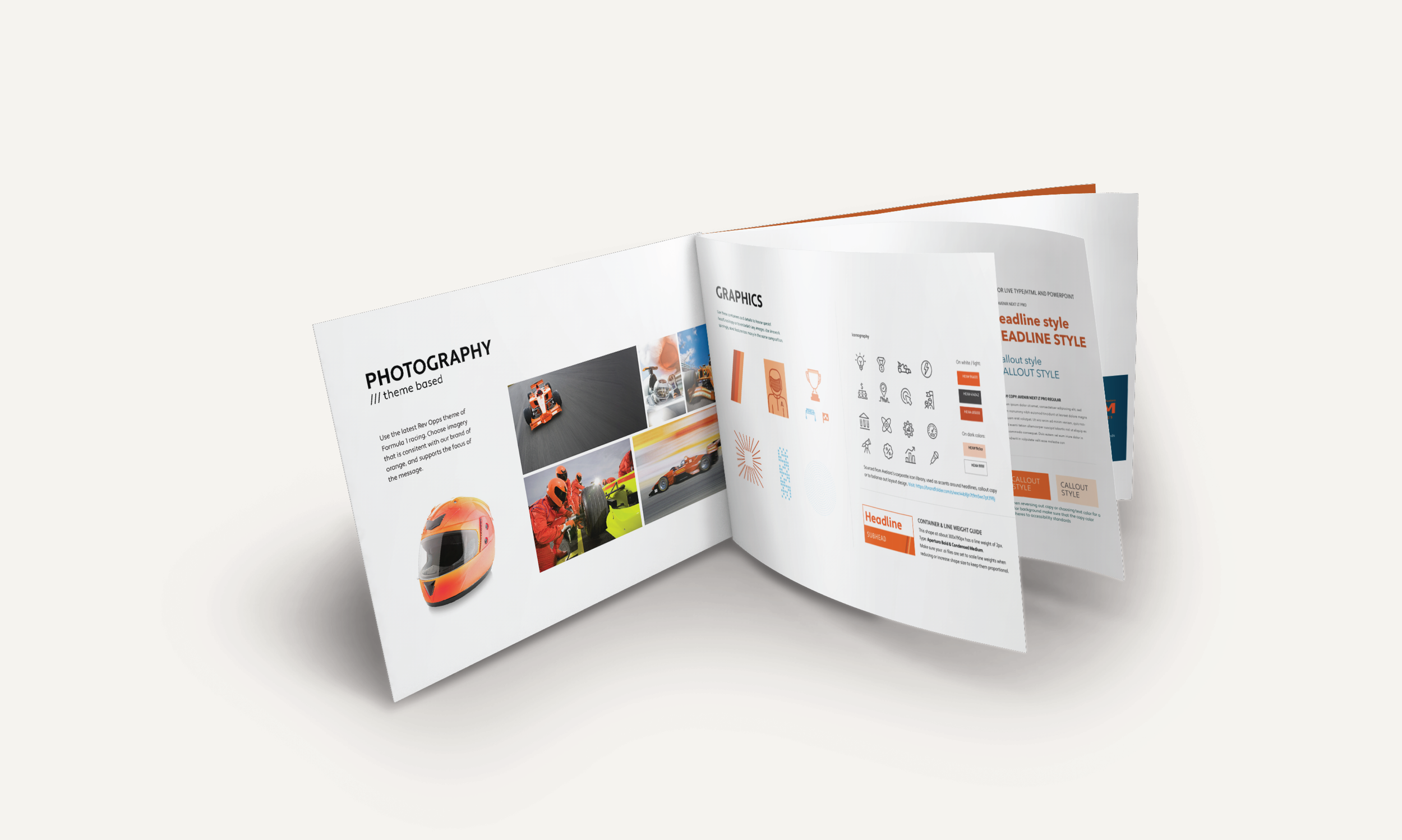
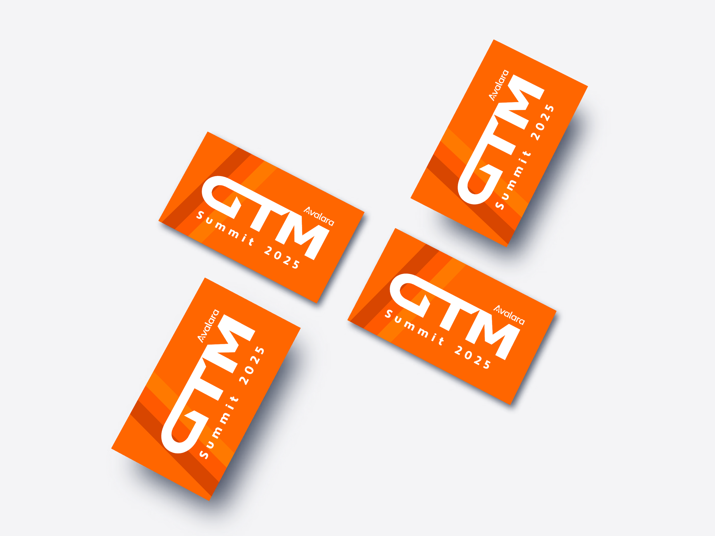
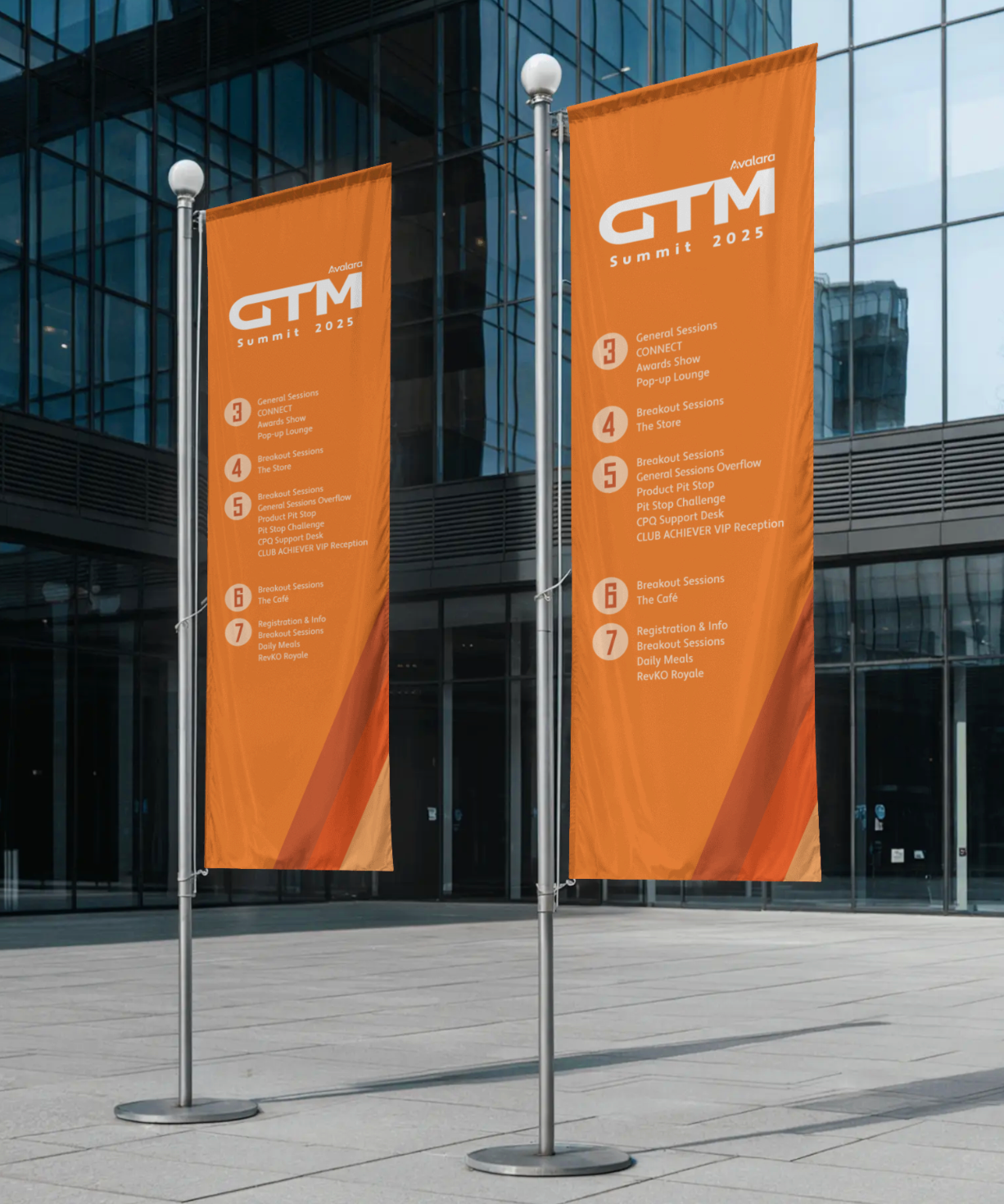
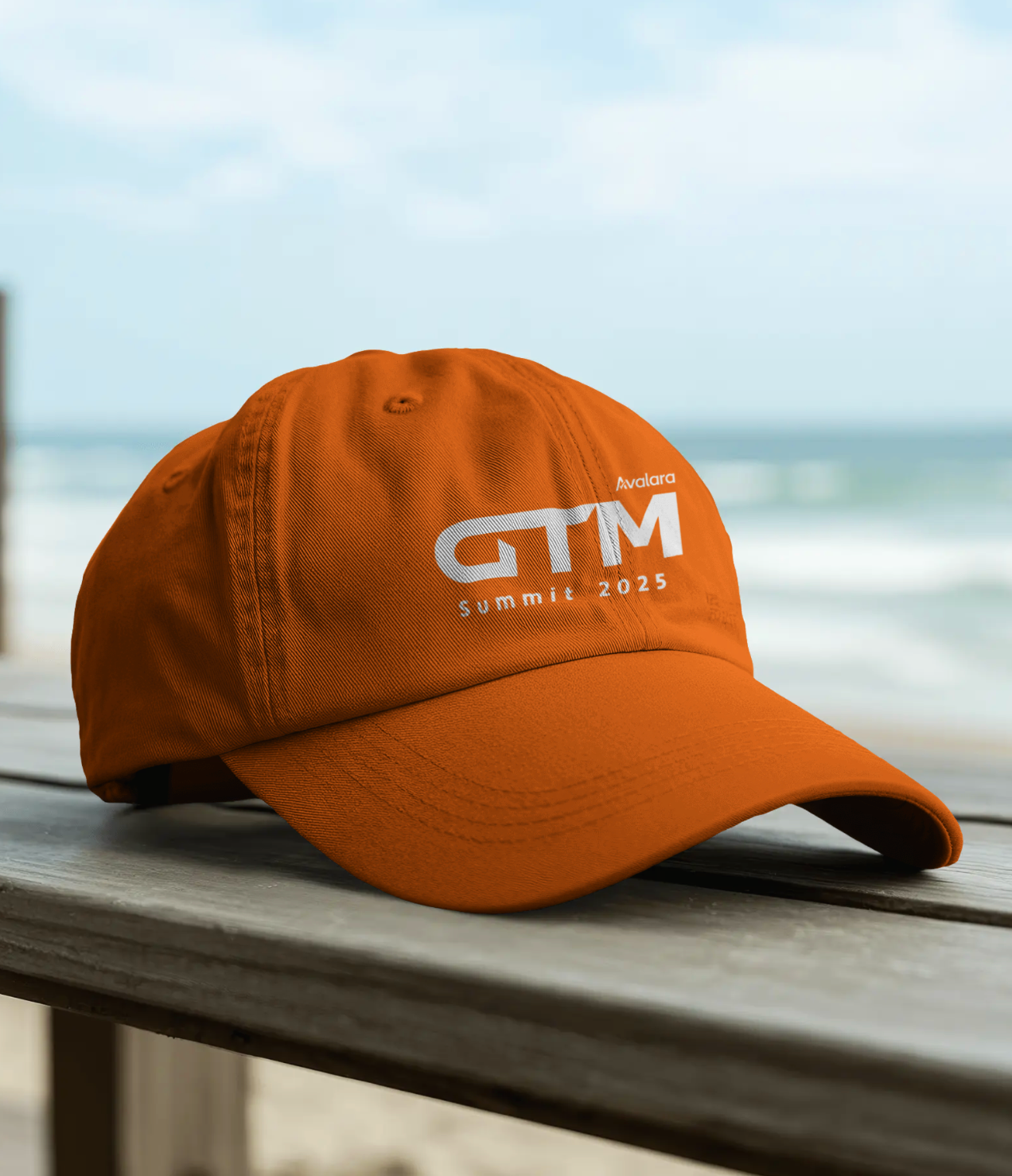
The ideation focused on bringing Avalara’s spirit of go getter spirt to life. This led to a Formula 1-inspired theme—capturing speed, precision, and a high-performance mindset. The visual identity used dynamic typography and energetic layouts to create a bold, cohesive, and motivating experience across all touchpoints.
-
A complete and cohesive event branding was brought to life—spanning stage design, merchandise, visual systems, and themed photography. The unified identity, rooted in the “Smarter. Better. Faster.” narrative, created a high-energy and immersive experience across all arenas, making GTM 2025 a grand success.
From strategy
to shelf
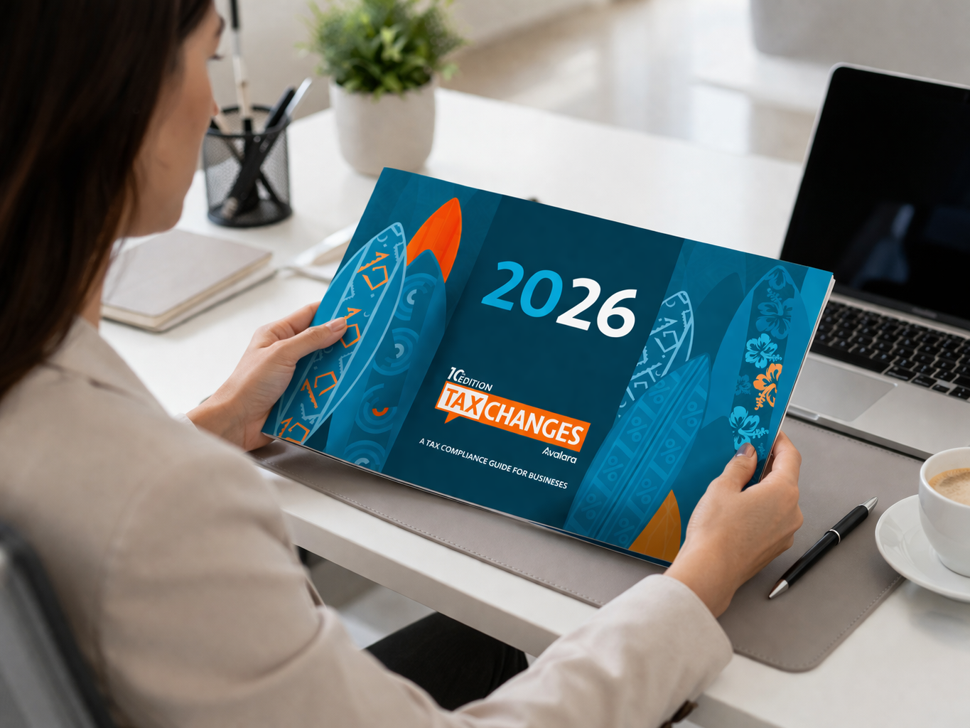
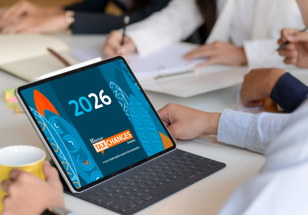
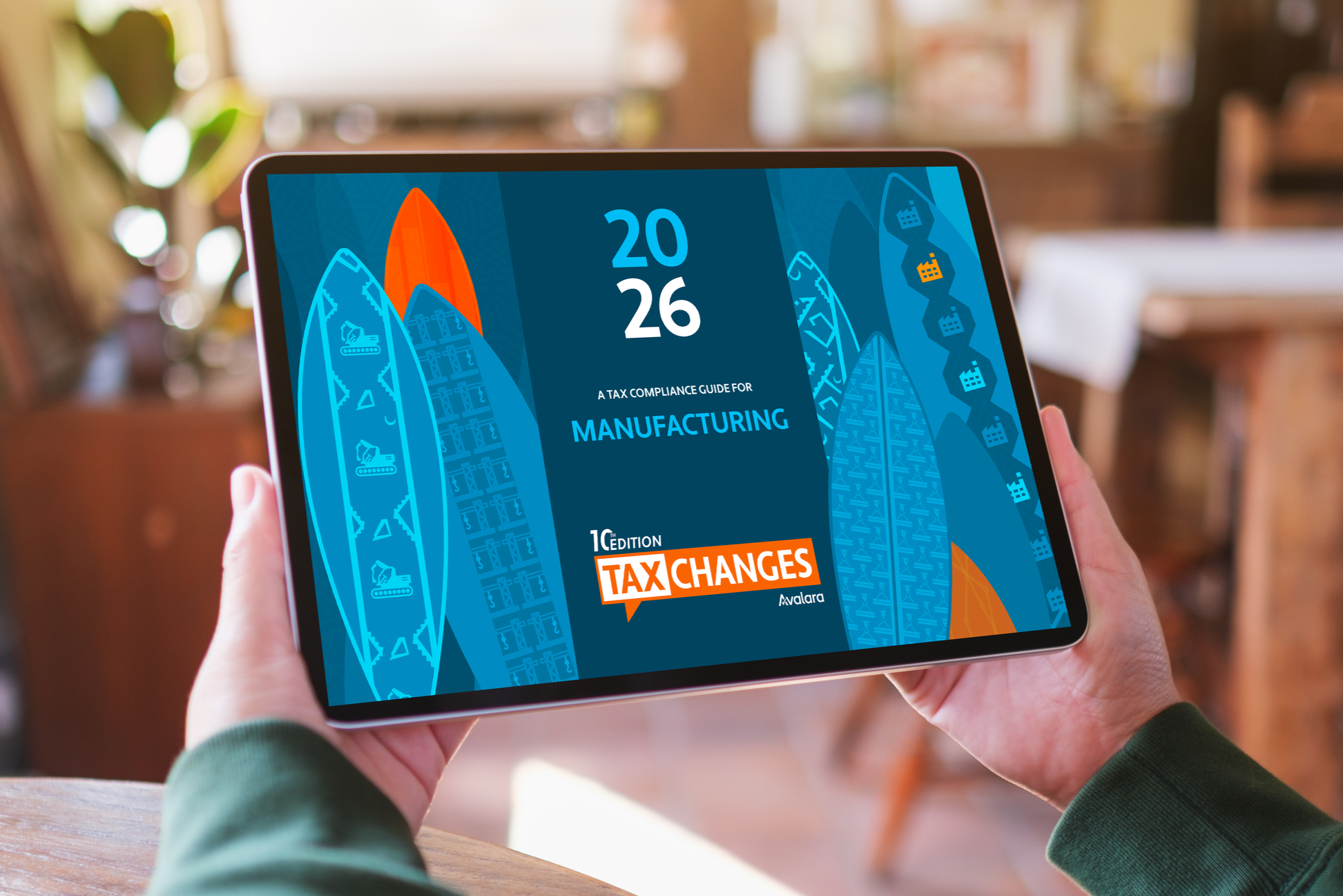
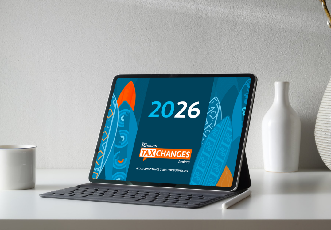
Avalara Tax Changes
-
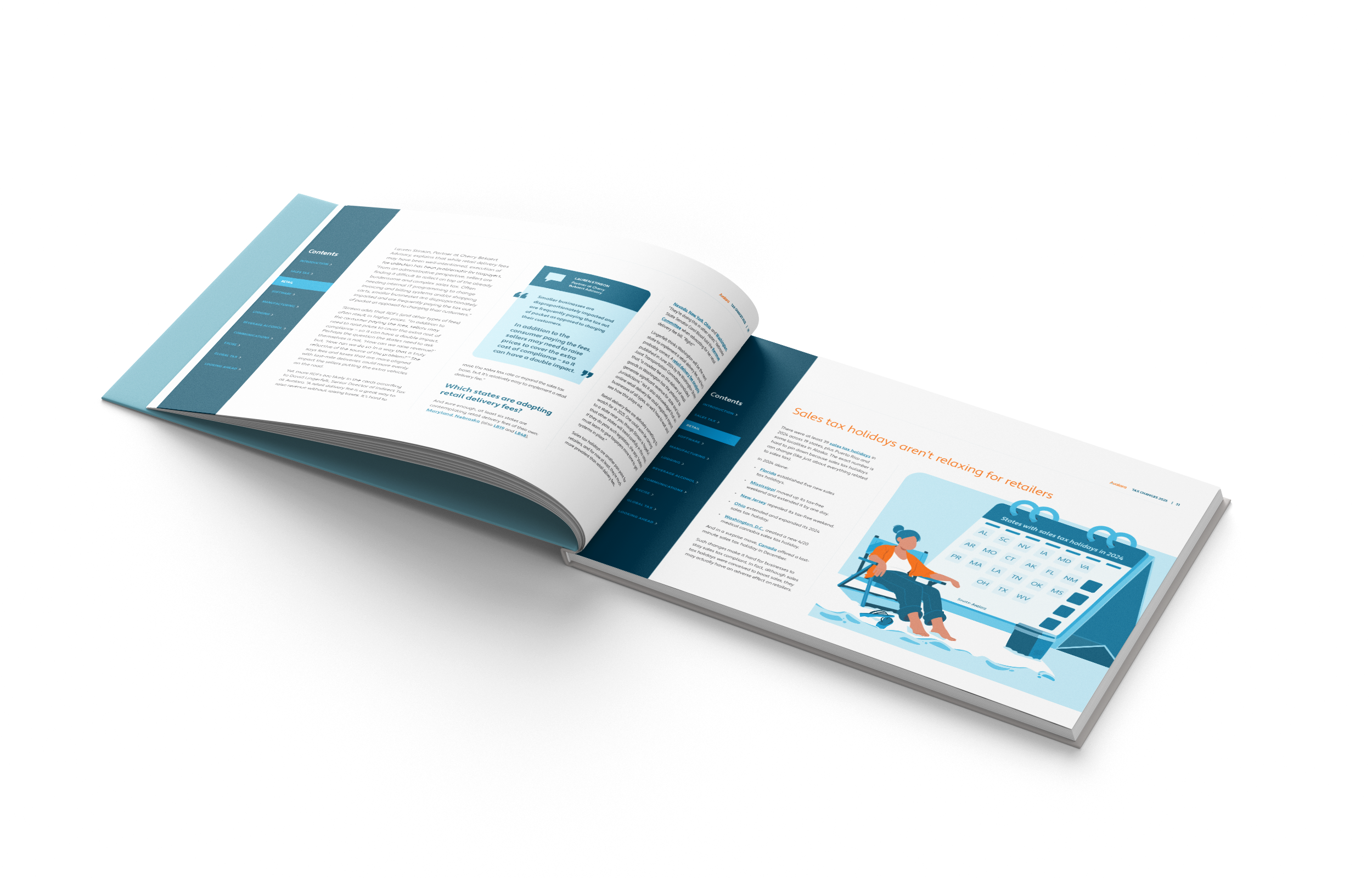
Avalara Tax Changes (ATC) is Avalara’s signature publication that explores emerging shifts in sales tax compliance, combining expert insights with industry-focused trends across retail, hospitality, software & beyond.
-
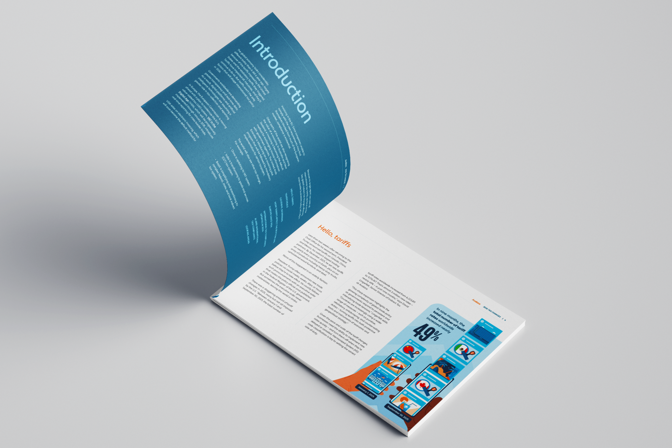
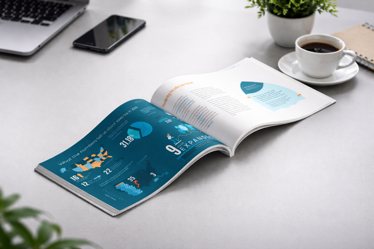
Operating across multiple industries, Avalara navigates the complexity of sales tax—an essential yet often opaque system shaped by 13,000+ U.S. jurisdictions and constant regulatory change. To simplify this landscape, key updates are consolidated into a single, accessible resource—enabling fintech professionals to stay informed and make confident decisions. To achieve its vision of becoming “part of every transaction in the world,” Avalara wanted to pair its technology with authority, clarity, and trust.
-
In my role as lead designer, I shaped the creative process through research, content alignment, and audience understanding. Designing for a fintech audience, I evolved ATC’s blue-driven visual language into a system that felt structured yet approachable. From identifying illustration moments and finalizing the cover to refining every visual with an editorial eye, I ensured consistency across the experience.
The focus was to simplify complex data into clear, accessible design through illustration and graphics. -
Leading the project in collaboration with Avalara leadership, I transformed the Sales Tax Changes report into a flagship annual publication—designed to simplify complex tax and compliance trends into clear, actionable insights across multiple industries. While the content scale was extensive, the focus went beyond coverage to building trust.
I ensured the report stayed relevant to diverse business needs while positioning Avalara as a definitive authority in sales tax compliance.
Flagship
Compendium
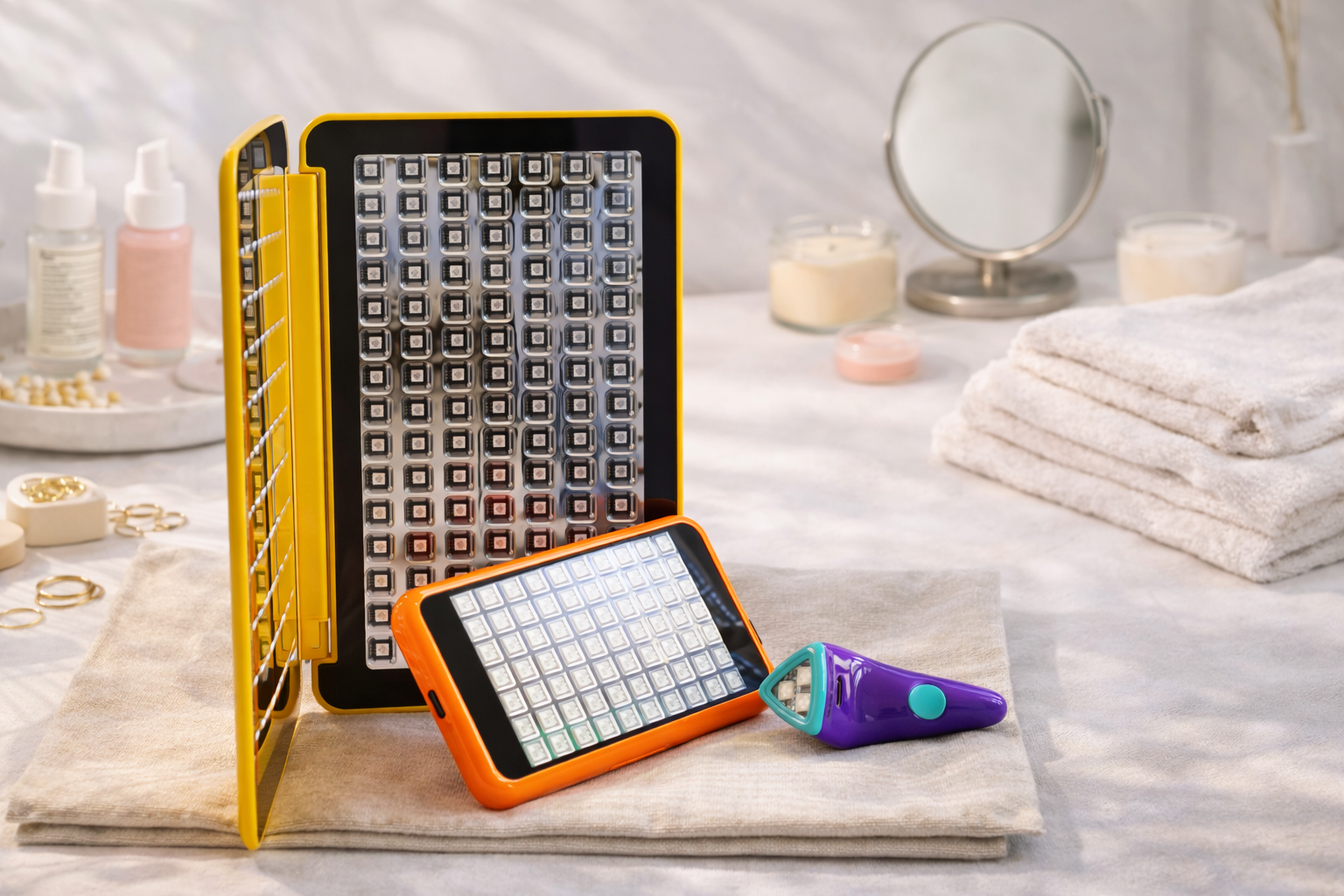
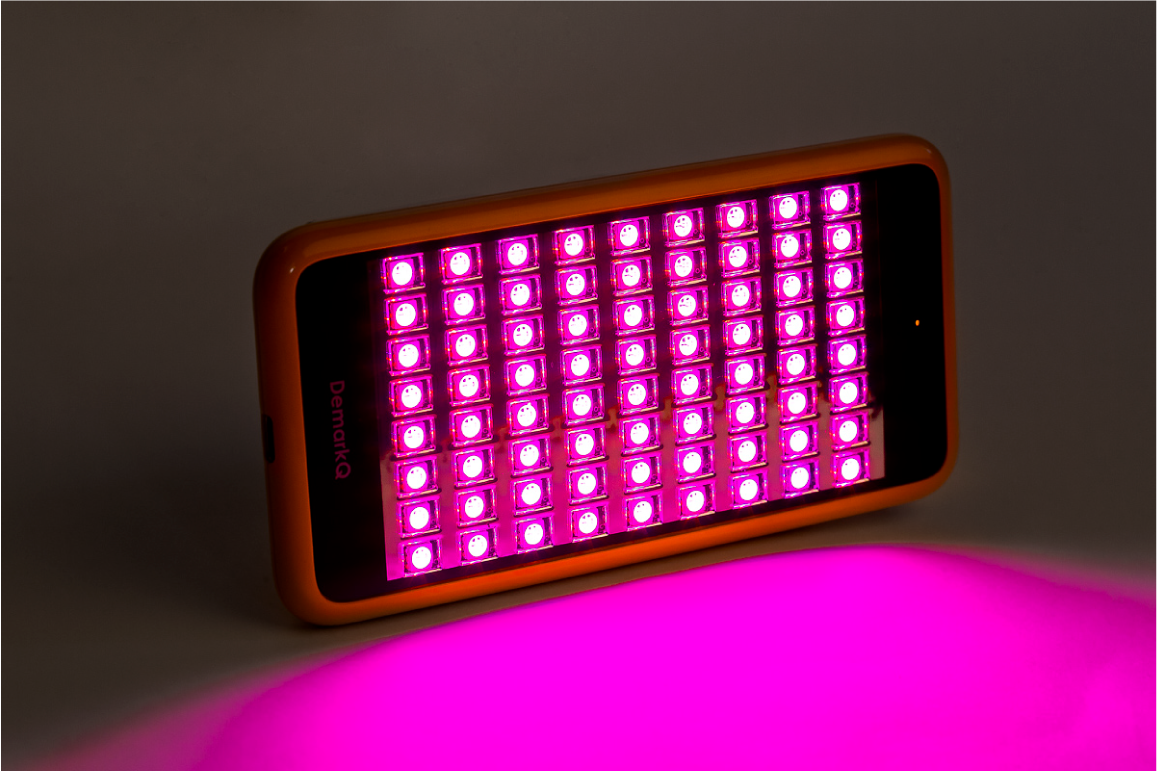
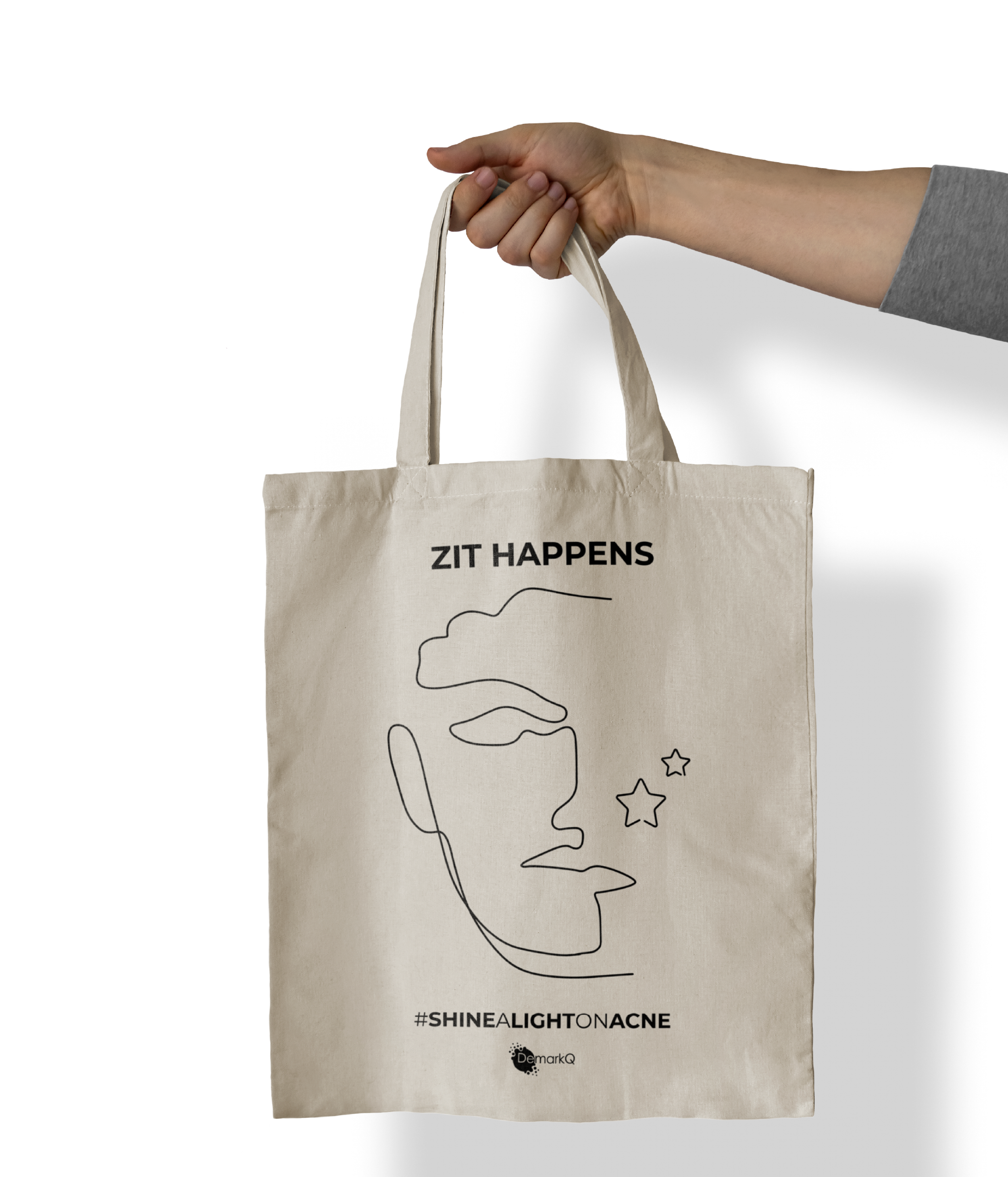
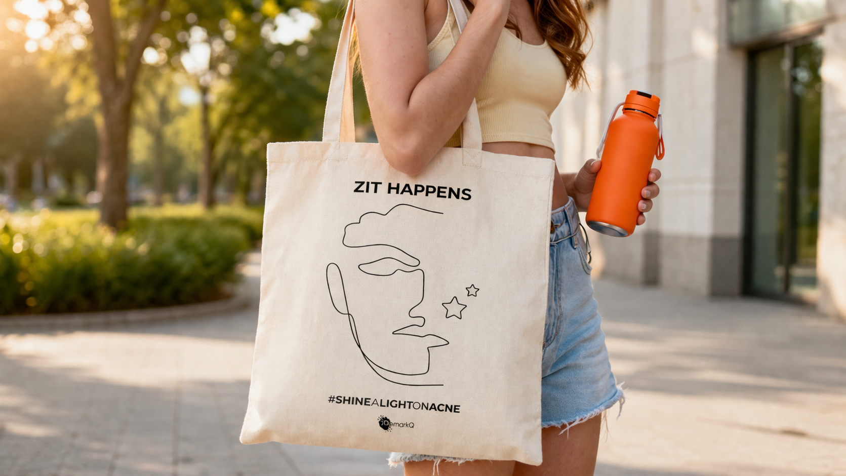
DemarkQ
-
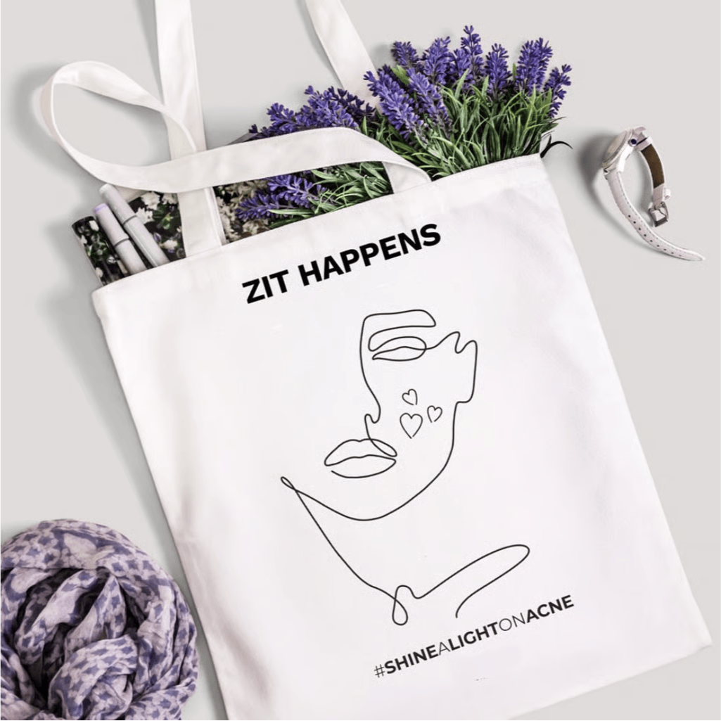
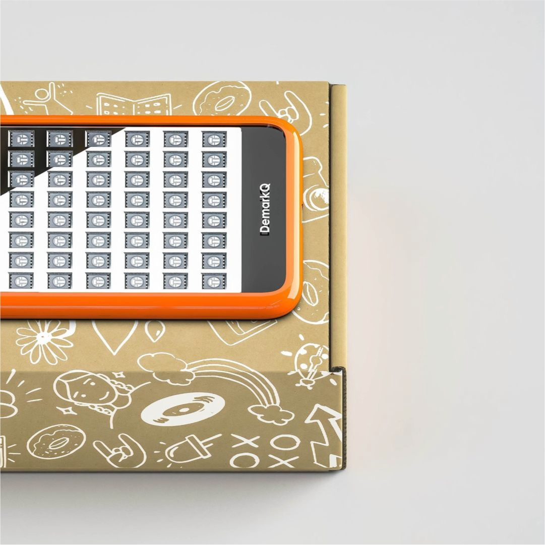
DemarkQ is a Europe-focused skincare technology brand offering LED light therapy devices designed specifically for teenagers. Targeting common skin concerns such as acne, dark spots, and early skin damage, DemarkQ combines clinical efficacy with user-friendly design.
-
To translate demarkQ’s science-meets-accessibility positioning into a cohesive brand experience across merchandise, social media, and messaging. The key challenge was balancing clinical credibility with an approachable, teenager-friendly tone making sure the brand feels reliable and uplifting, while still staying easy to understand and approachable.


The science
of skincare